Annika Syrjämäki

3D restaurant

3D restaurant

by Oatmeal Studio

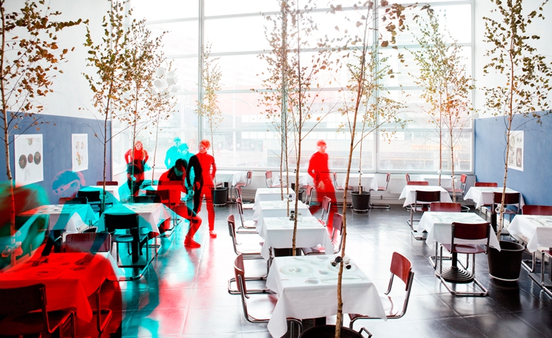
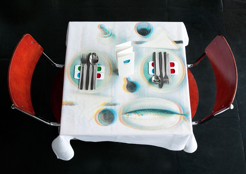
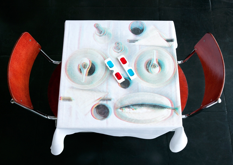
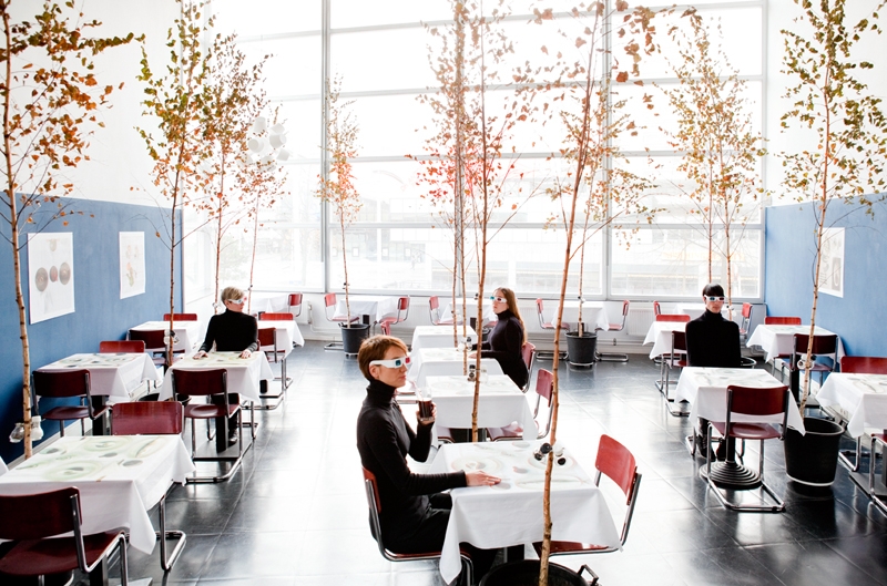
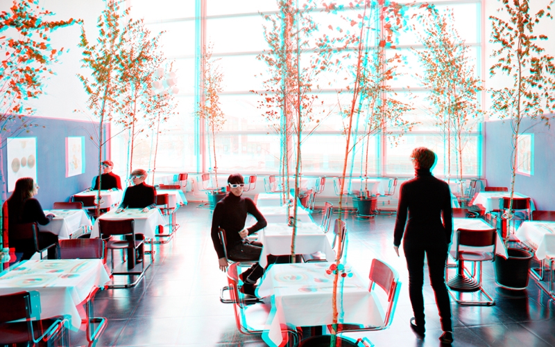
Film is illusion, stories are told using fiction and reality
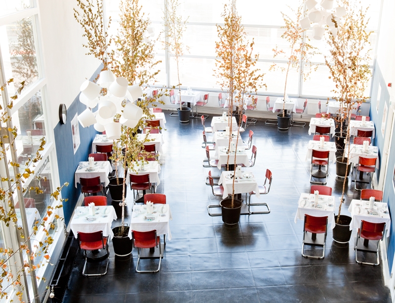
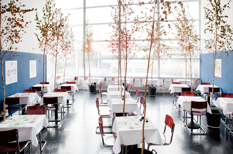
Inspired by this theme we designed the interior for the Filmhuis Restaurant

Poetic solutions where found for practical problems.
The birch trees and the deep blue walls creates a intimate atmosphere.
Oatmeal Studio invites the visitors to see the world around them in a different way,
visual gifts are to be discovered for those who see.

Filmhuis Den Haag

November, 2012

IkHa

IkHa

by Oatmeal Studio

Oatmeal Studio hacks Ikea

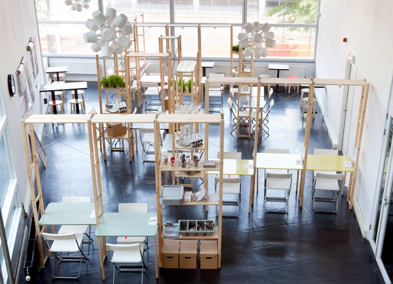
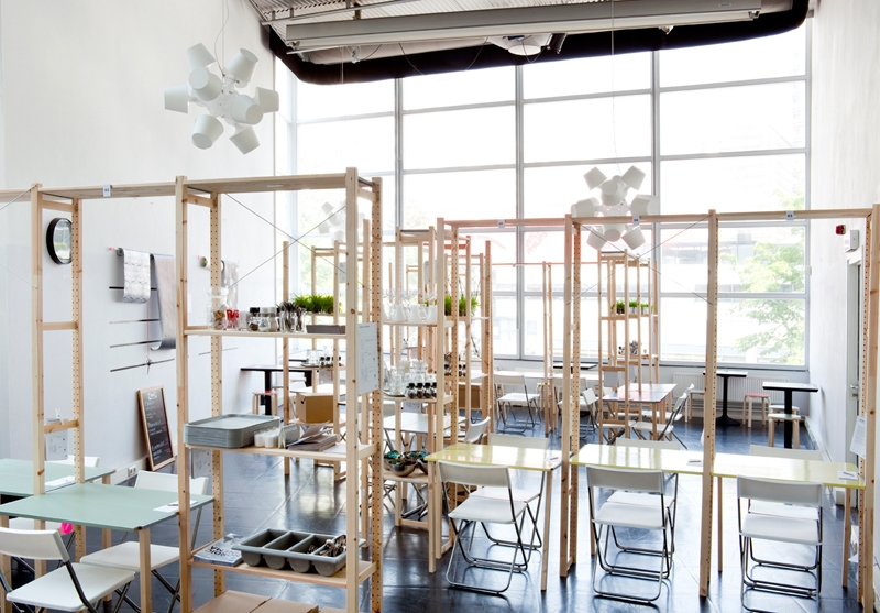
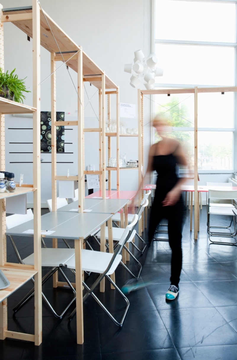
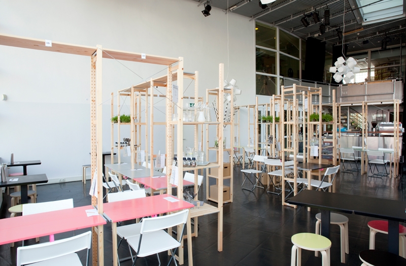
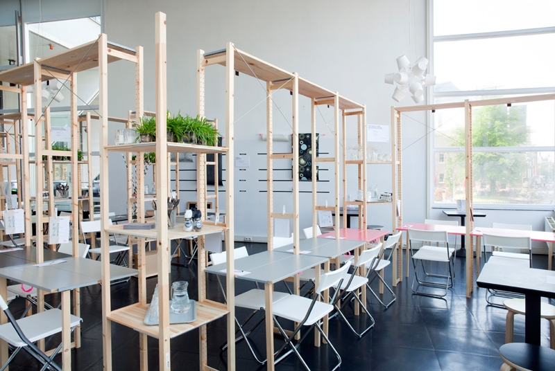
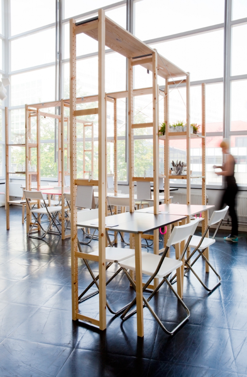
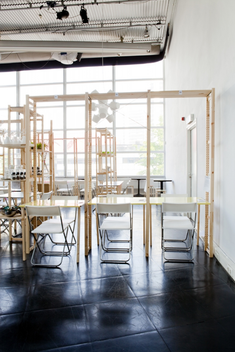
IkHa is a dining experience by Oatmeal Studio, where the concept of IKEA has been dismantled and translated into a restaurant interior. Itʼs not a self service restaurant in the usual sense of the word. Instead, visitors are invited to participate and customize their surroundings while dining. While ʻIKEA hackingʼ – or creating spaces using the budget-savvy Swedish brandʼs products in new ways– is a popular trend, the designers say they wanted to extend this concept.

IkHa is based on the showroom of IKEA itself. A maze of shelves and rooms to navigate, often multiple times as one reconsiders their choices, and then arrives home with their flat-packed goods to begin the assembly process.

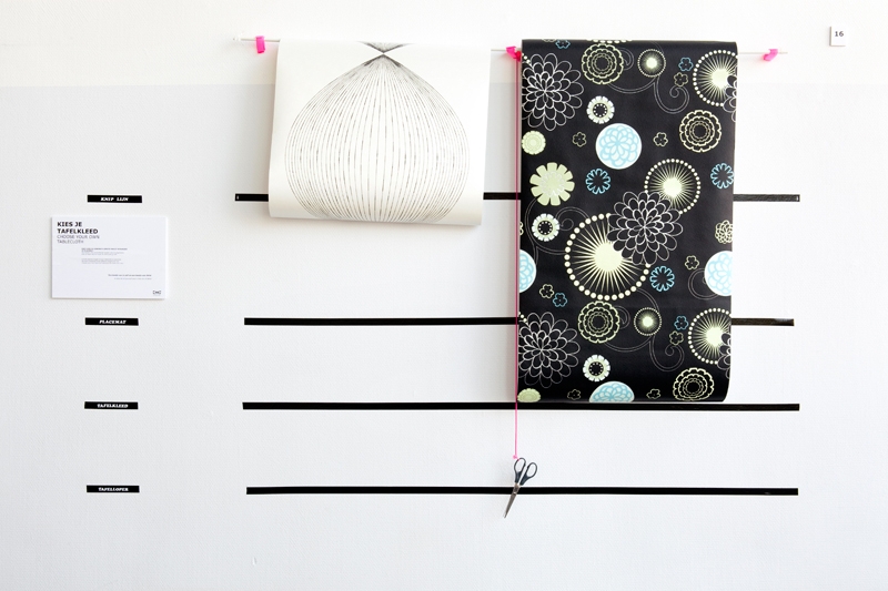
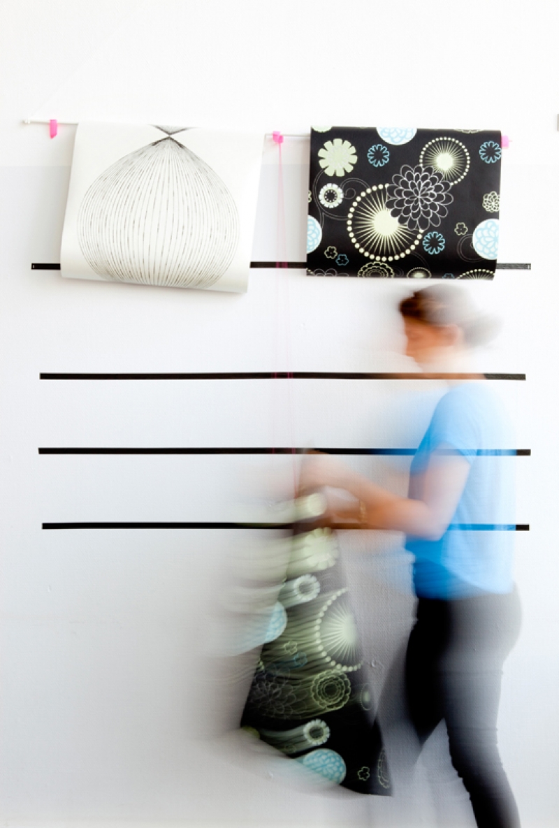
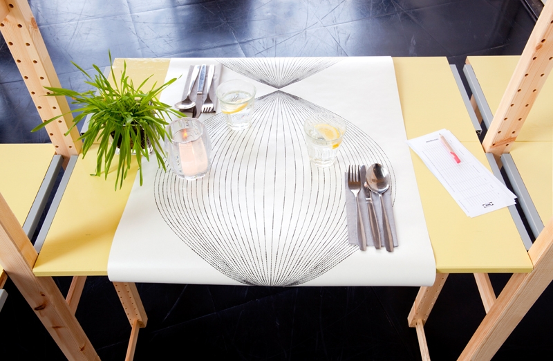
Fortunately, they also sell Swedish Meatballs. Guests fill in their ordering forms with pencils and dinner is served on trays, delivered to the furniture construction at which theyʼve chosen to sit. Visitors can create their table setting from a selection of materials and cut their own tablecloth or placemat from a selection of wallpapers, ready to measure and cut.

“Even the Swedish meatballs are hacked”...and very nice, according to one patron of the restaurant.

One of IKEA slogans is “Big ideas for small spaces”, an important aspect of the IkHa restaurant.

Everything is collapsible and fold-able and when not in use can be quickly broken down to fit within a two square meter space.

This makes it ideal for temporary solutions, events, and festivals, according to the designers.Oatmeal Studio hacks Ikea

IkHa is a dining experience by Oatmeal Studio, where the concept of IKEA has been dismantled and translated into a restaurant interior. Itʼs not a self service restaurant in the usual sense of the word. Instead, visitors are invited to participate and customize their surroundings while dining. While ʻIKEA hackingʼ – or creating spaces using the budget-savvy Swedish brandʼs products in new ways– is a popular trend, the designers say they wanted to extend this concept.

IkHa is based on the showroom of IKEA itself. A maze of shelves and rooms to navigate, often multiple times as one reconsiders their choices, and then arrives home with their flat-packed goods to begin the assembly process.

Fortunately, they also sell Swedish Meatballs. Guests fill in their ordering forms with pencils and dinner is served on trays, delivered to the furniture construction at which theyʼve chosen to sit. Visitors can create their table setting from a selection of materials and cut their own tablecloth or placemat from a selection of wallpapers, ready to measure and cut.

“Even the Swedish meatballs are hacked”...and very nice, according to one patron of the restaurant.

One of IKEA slogans is “Big ideas for small spaces”, an important aspect of the IkHa restaurant.

Everything is collapsible and fold-able and when not in use can be quickly broken down to fit within a two square meter space.

This makes it ideal for temporary solutions, events, and festivals, according to the designers.
Filmhuis Den Haag

May, 2012

Hanging Garden

Hanging Garden

by Oatmeal Studio


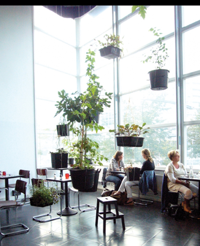
Oatmeal Studio were asked to make an architectonic interference in the space for
the summer restaurant of Filmhuis den Haag.
What more can you wish for in the summer than eating out in the nature under the
trees.
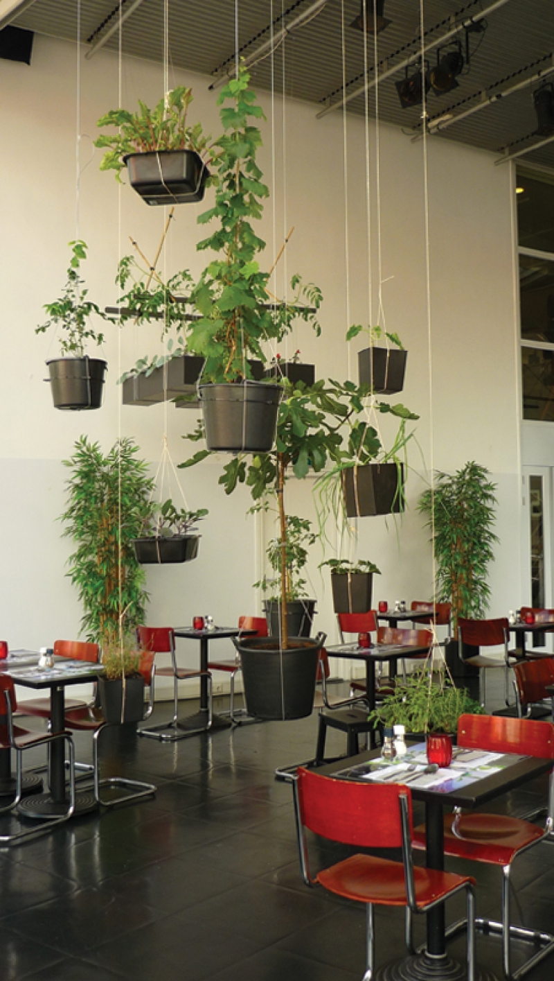
Inspired by summer feelings, the seven world wonders we descided to make a
hanging vegetable garden.
Hereby not only Oatmeal Studio visualized the connection between production and
consumption, they gave the guest a new eating experience.
With the view of the skyline of the Hague guest where surrounded by the hanging
garden.
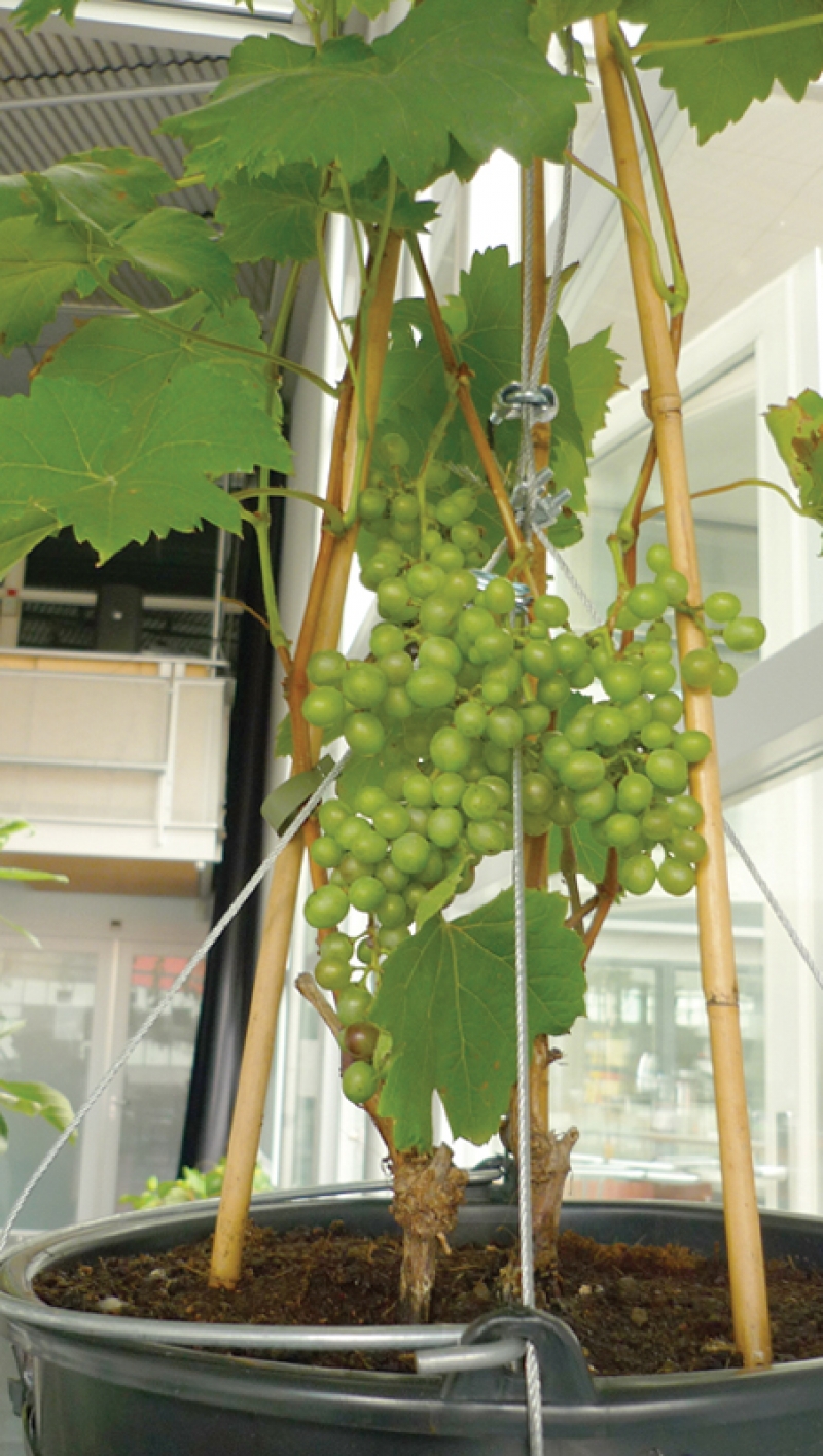
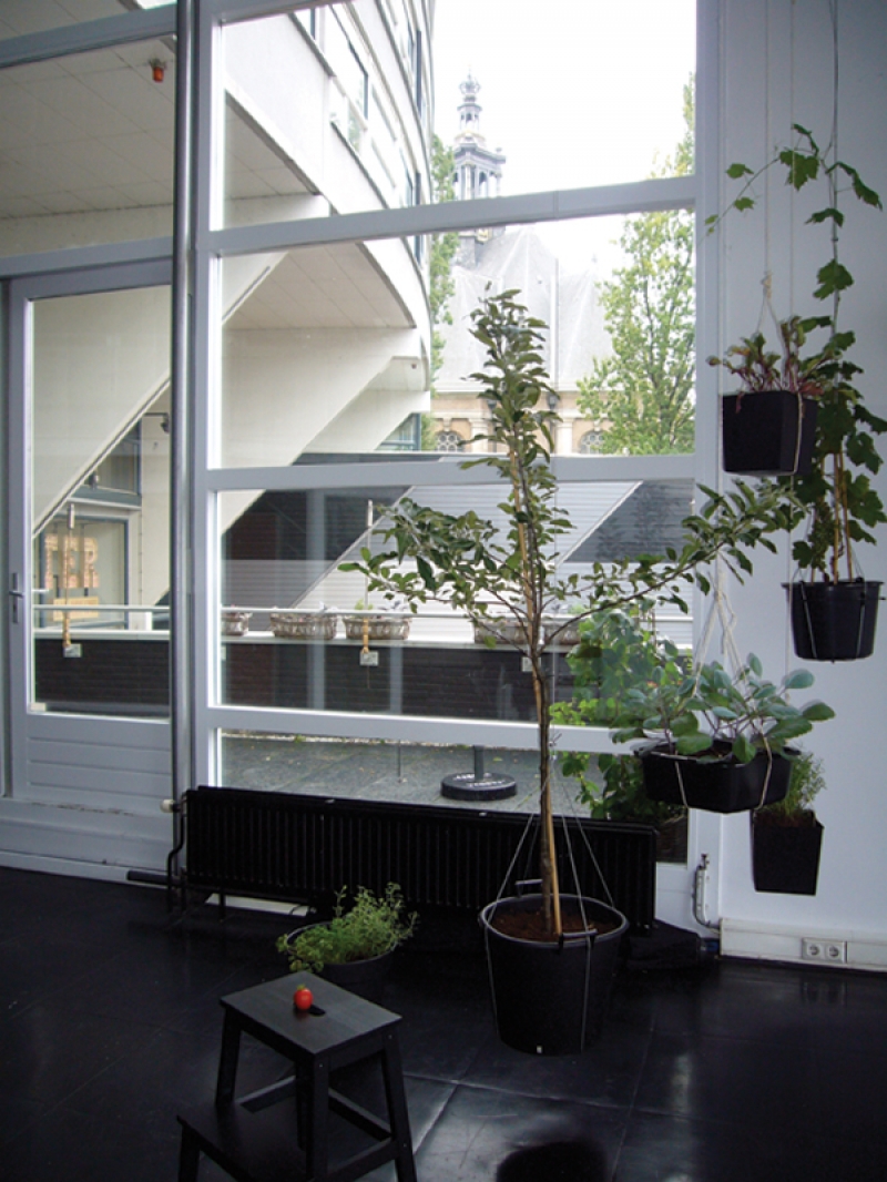
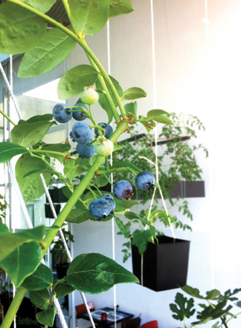
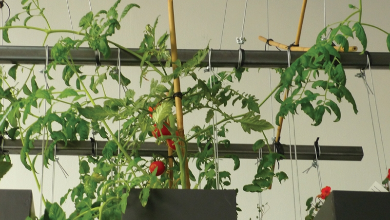
Zucchini, and tomato plants, fig and apple trees, strawberry and gooseberry plants
and all kind of herbs hang on different heights in the space.
Guest where invited to enrich their meal with fresh herbs, or pick a strawberry.
And not unimportant in the Netherlands- it was possible to enjoy an outdoor
experience on an evening less citable for this.

Filmhuis Den Haag, The Hague, Netherlands

July, 2010

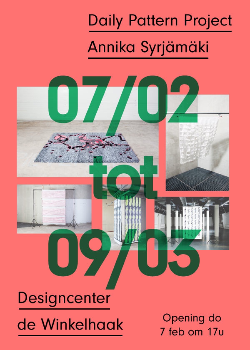
Daily Pattern Project Exbibition

Daily Pattern Project Exbibition

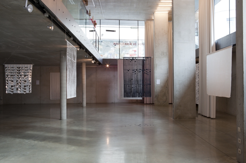
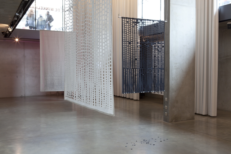
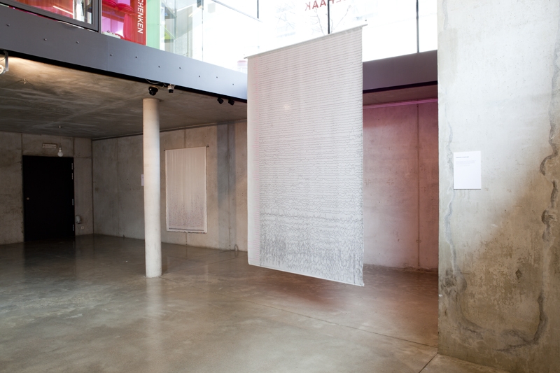
at Designcentrum De Winkelhaak, Antwerpen, Belgium

Poster by PieterJan Grandry

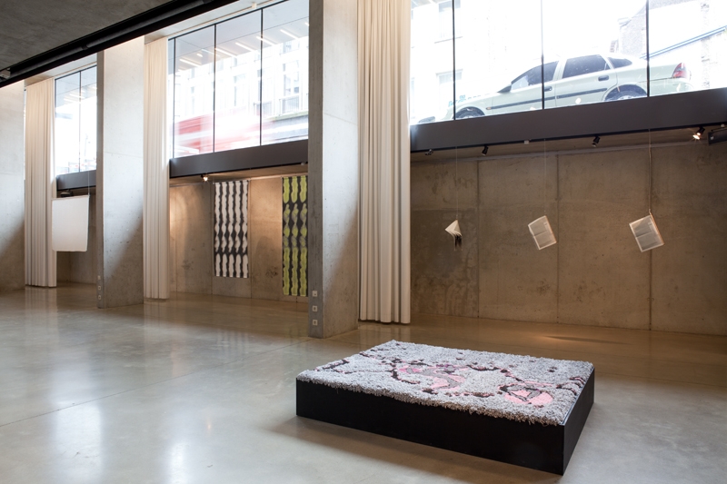
Daily Pattern project at Designcentrum "De Winkelhaak" Antwerpen, Belgium

7 February 2013- 9 March 2013

De Winkelhaak, Antwerpen, Belgium

Daily Pattern Project

Daily Pattern Project

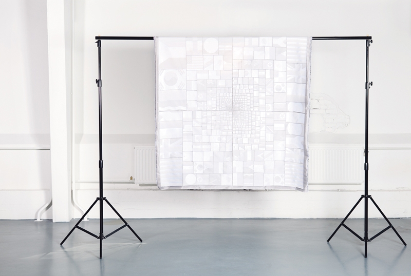
Who's talking

This pattern is build up from 4 different tree maps, each from a different newspaper. A program was used to calculate, per newspaper, which country appeared most in the headlines for the first half of 2010. Sources:
Top left: Shanghai Daily,
Top right: The Guardian,
Bottom left: The Citizen,
Bottom right: New York Times

What’s it all about?


The daily pattern is a research project exploring the possibilities of contentbased
textile design in which the daily news is used as the inspiration and
content for the patterns.

For the Daily Pattern project, I printed a newspaper, you can download the presentation here.

dailypattern.pdf

1 1/4, 7-8.8, 21x

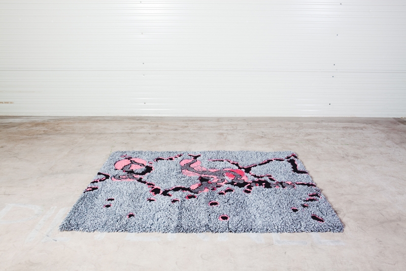
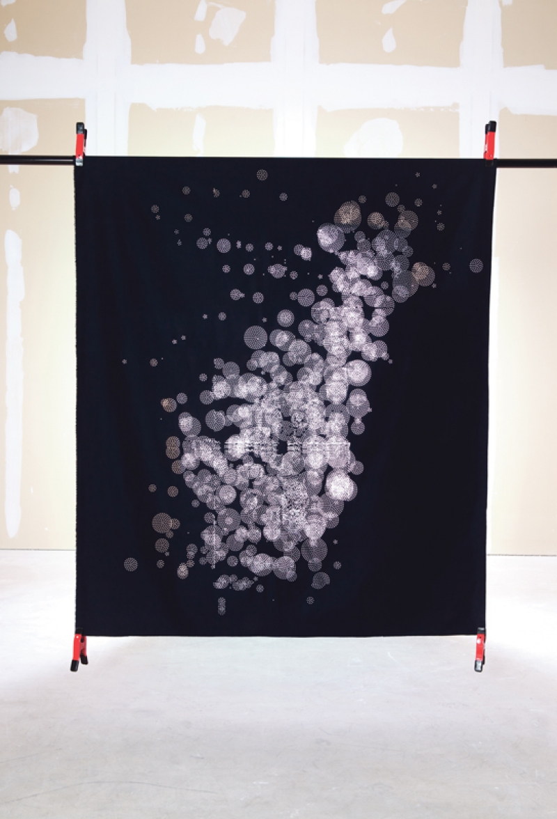
Carpet based on earthquakes in
the world 2009/2010. The size
of the circles shows the
magnitude, the color of the
circles shows its depth.
The carpet is hand tufted,
150x200 em

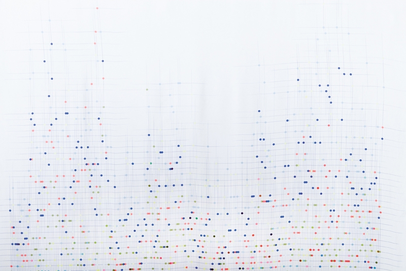
President vs Ash-cloud

The pattern is based on 100
words from news headlines over
2009/2010 it shows how often
they where used in the media
over the course of a year.

President vs Ash-cloud (detail)

+/-

Headlines from 5 different
newspapers over the course of a
week. A semantic
orientation search engine,
Oogle (lust.nl/oogle), was used
to determine the degree of
positivity or negativity of
each headline and to compare
between different newspapers.
From left to right: Washington
Post, The Witness,
The Guardian,
The Australian, China Daily.
Screen printed cotton with
transfer.

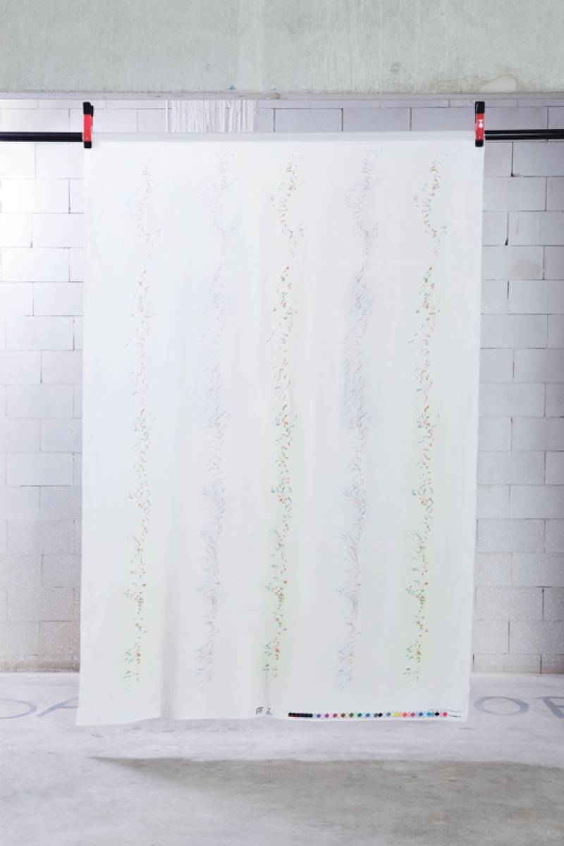
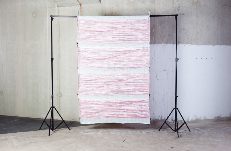
Windblows

A series of textiles based on
the weather forecast from De
Volkskrant over the first half
of 2010. Prints show wind
direction and strength (lines),
percentage sun (dots) and
percentage rain (circles)
during this period.

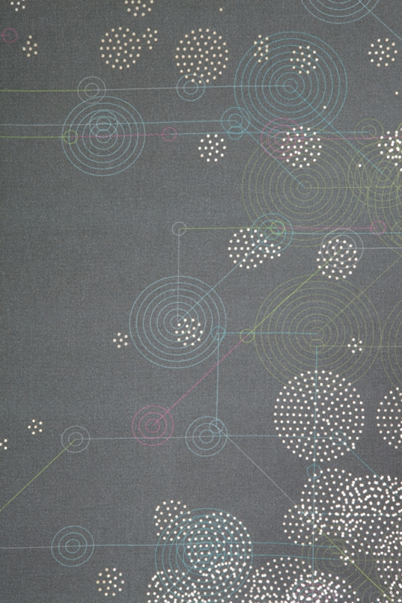
Sunshower#1

A series of textiles based on the weather forecast from De Volkskrant over the first half of 2010. Prints show wind direction and strength (lines), percentage sun (dots) and percentage rain (circles) during this period.

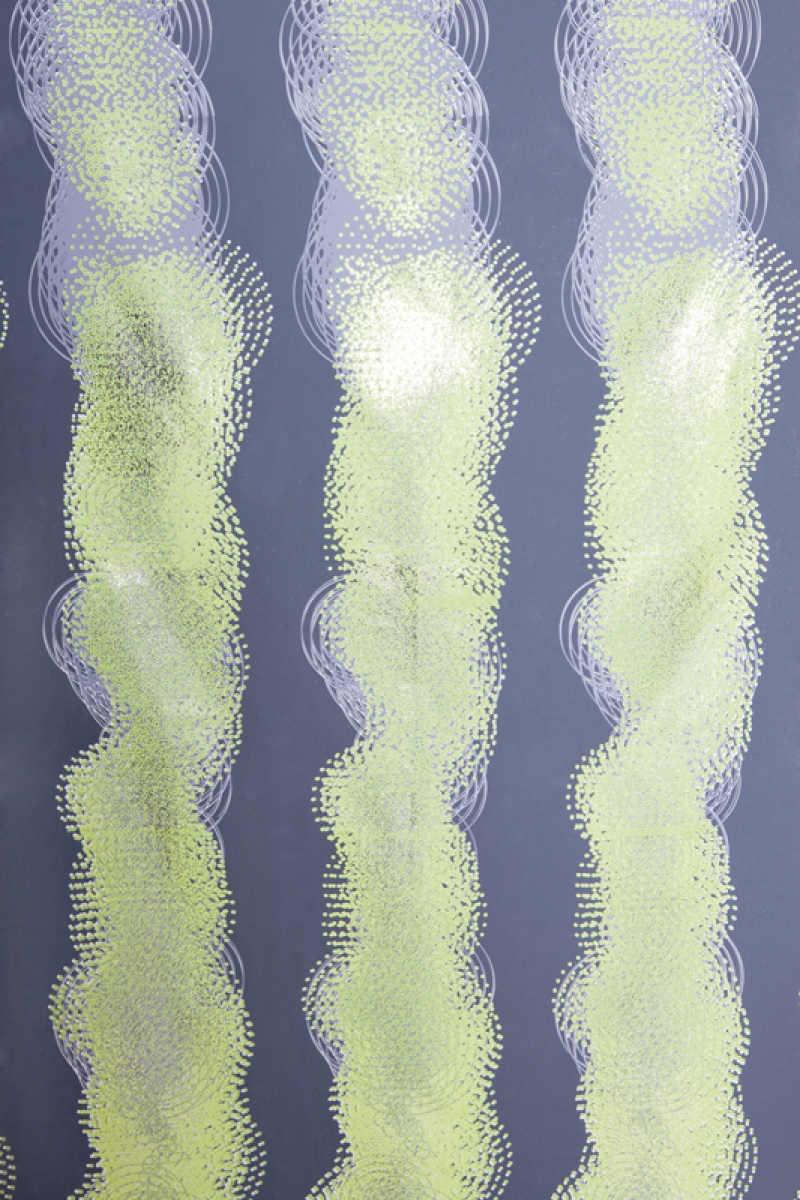
Sunshower #2

A series of textiles based on
the weather forecast from De
Volkskrant over the first half
of 2010. Prints show wind
direction and strength (lines),
percentage sun (dots) and
percentage rain (circles)
during this period.

AnyWay the wind blows (detail)

A series of textiles based on
the weather forecast from De
Volkskrant over the first half
of 2010. Prints show wind
direction and strength (lines),
percentage sun (dots) and
percentage rain (circles)
during this period.

Anyway te wind blows

A series of textiles based on
the weather forecast from De
Volkskrant over the first half
of 2010. Prints show wind
direction and strength (lines),
percentage sun (dots) and
percentage rain (circles)
during this period.

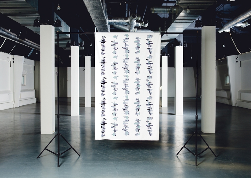
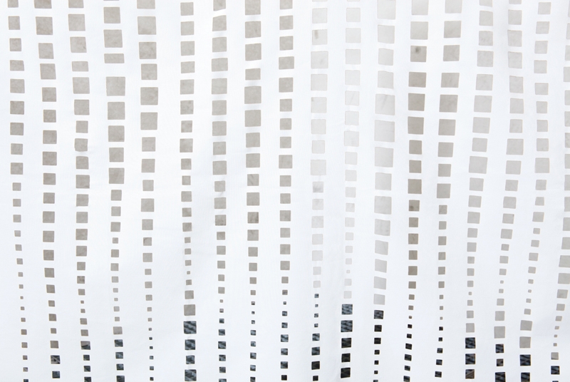
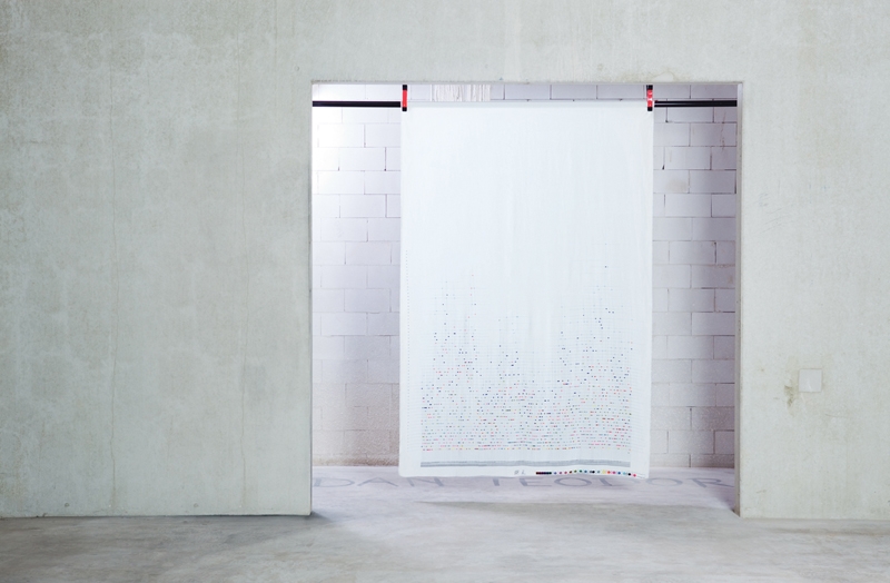
Stocks Falling #1

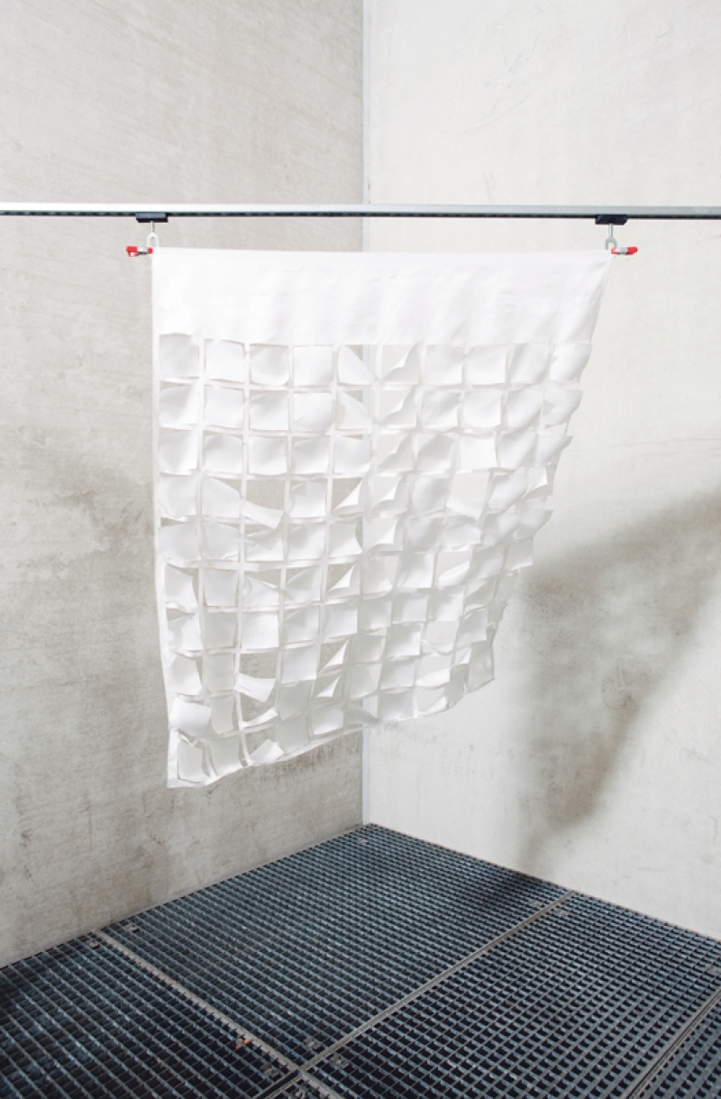
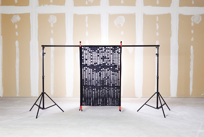
Patterns based on the stock
market indices over 52 weeks
(2009) using information
from Yahoo finance. The information
is transformed into a
pattern of squares,

Stocks Falling #2

Patterns based on the stock
market indices over 52 weeks
(2009) using information
from Yahoo finance. The information
is transformed into a
pattern of squares,

Stocks Falling #2 (detail)

Patterns based on the stock
market indices over 52 weeks
(2009) using information
from Yahoo finance. The information
is transformed into a
pattern of squares,

Stocks Falling #3

Patterns based on the stock
market indices over 52 weeks
(2009) using information
from Yahoo finance. The information
is transformed into a
pattern of squares,

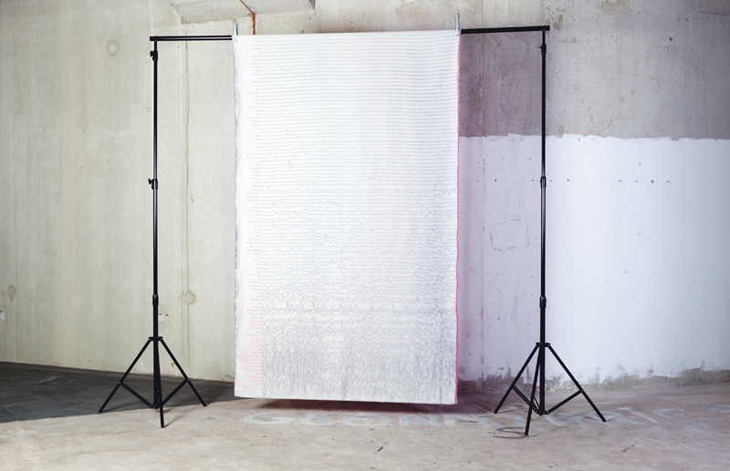
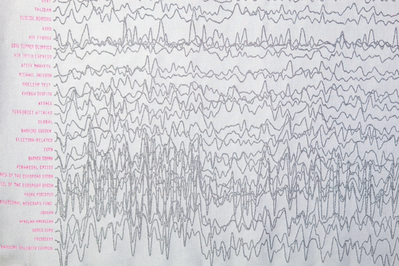
Longevity

This pattern shows how long we
care about particular news stories.
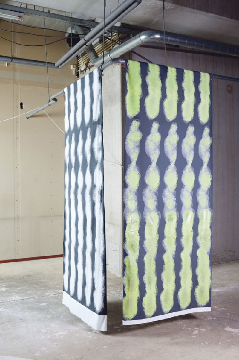
Headline topics
were tracked over a period of
time, demonstrating the length
of time they retained the
interest of the public.
Longevity (detail)

Political Party

The source material for this
pattern was the text from the
election program from 5
different political parties in
Sweden and The Netherlands.
These included the parties in
the coalition leading each
country and their most populist
parties .
Swedish parties: Alliansen and
Sverige Demokraterna.
Dutch parties: VVD, CDA and
pw.
The pattern is build up via an
arc diagram, linking the text
fragments together.

Political Party (detail)

Stocks falling random

About

About

Making stuff, thinking things. Textile and interior concepts.


At the monet I'm updating the website.


This site was designed and build by Daniel Powers with the kind support of Stroom